Thursday, September 28, 2017

Cherry printed rayon for a modern 1940s frock


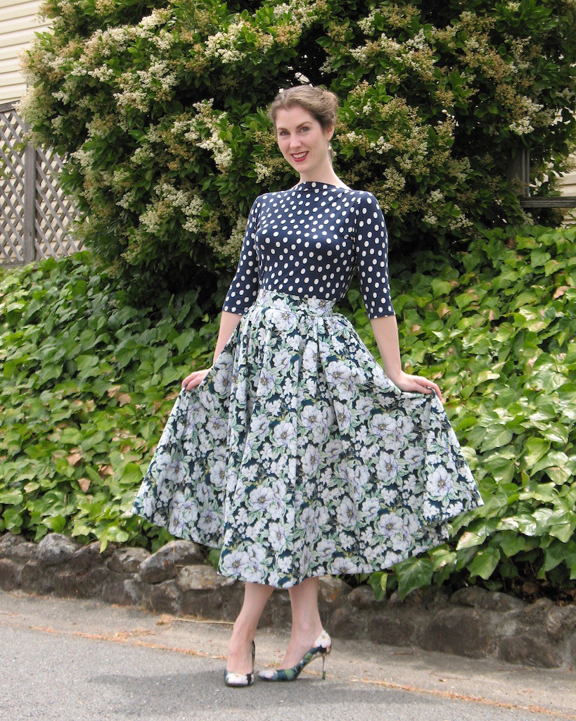
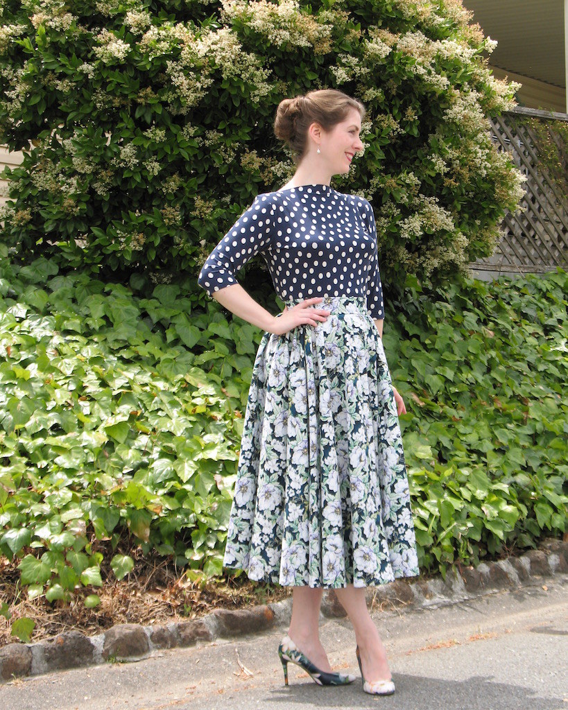
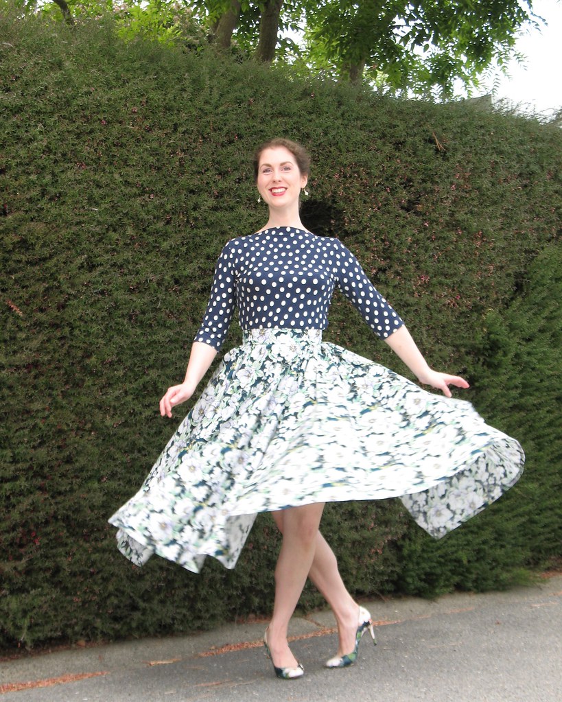
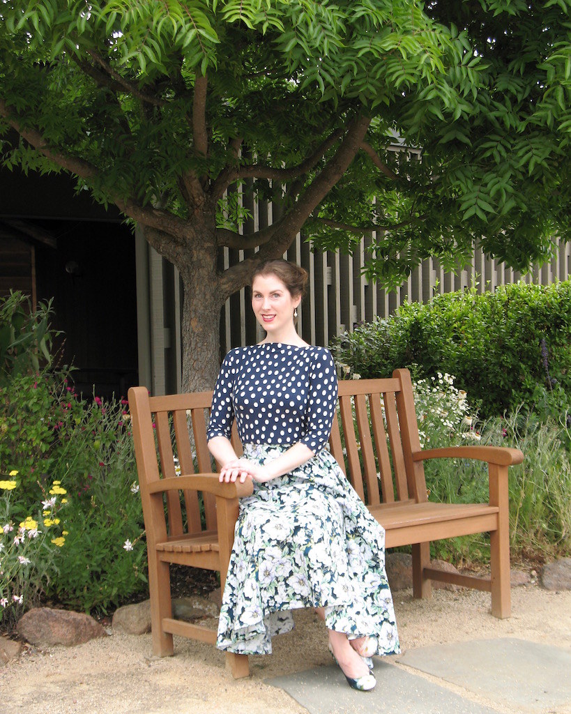
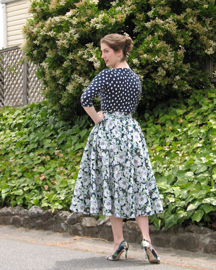
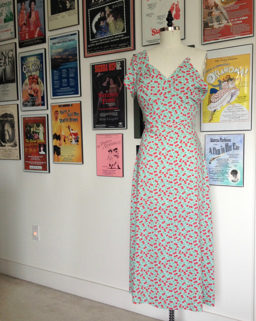
When I made this dress in July, it was seasonally appropriate to wear a lightweight rayon in a summery color scheme.  And while the current weather would actually make this a very comfortable garment to wear, the official arrival of Autumn makes me feel that it really is time to put aside the pastel tones.


So the dress was taken out on the town for one final wear a few days ago, washed, pressed, and put back in the closet until next year.


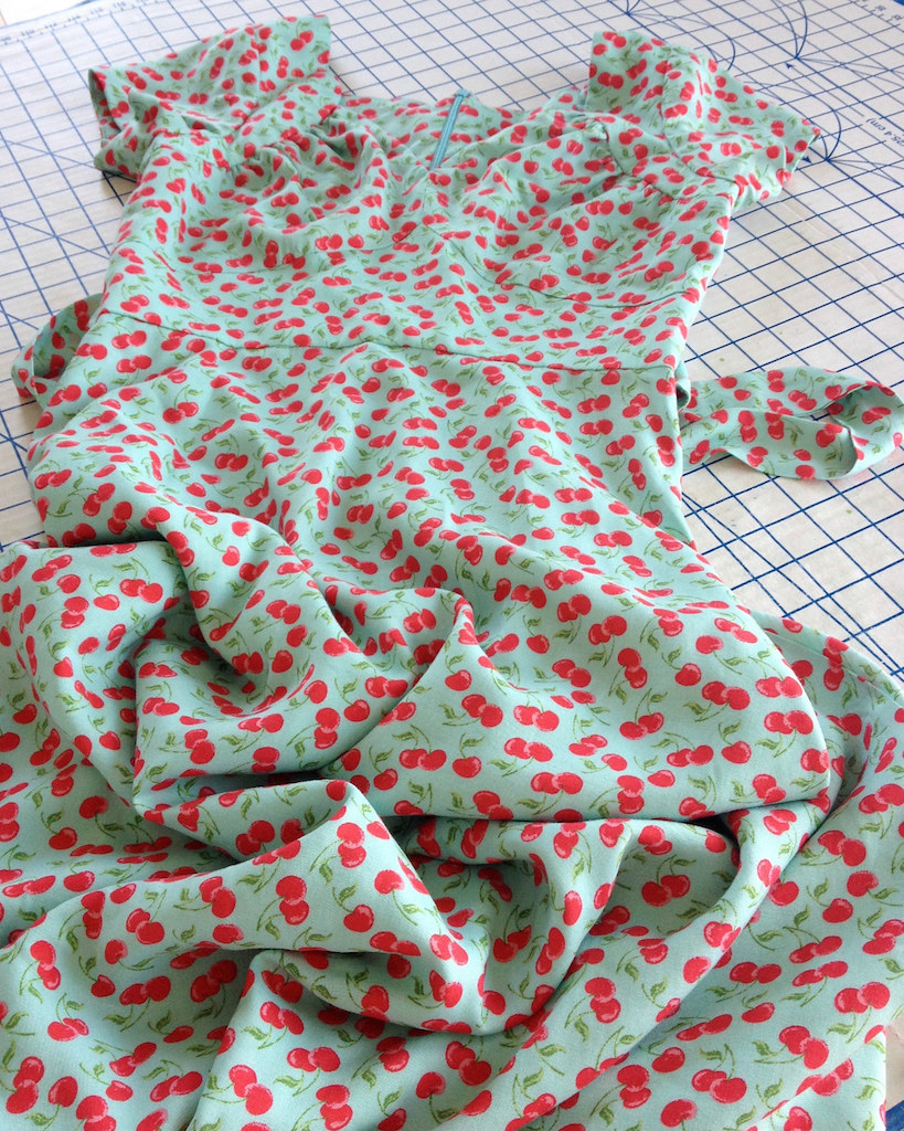
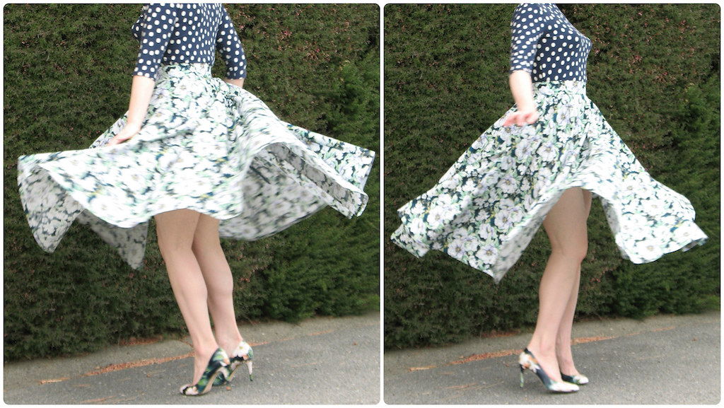
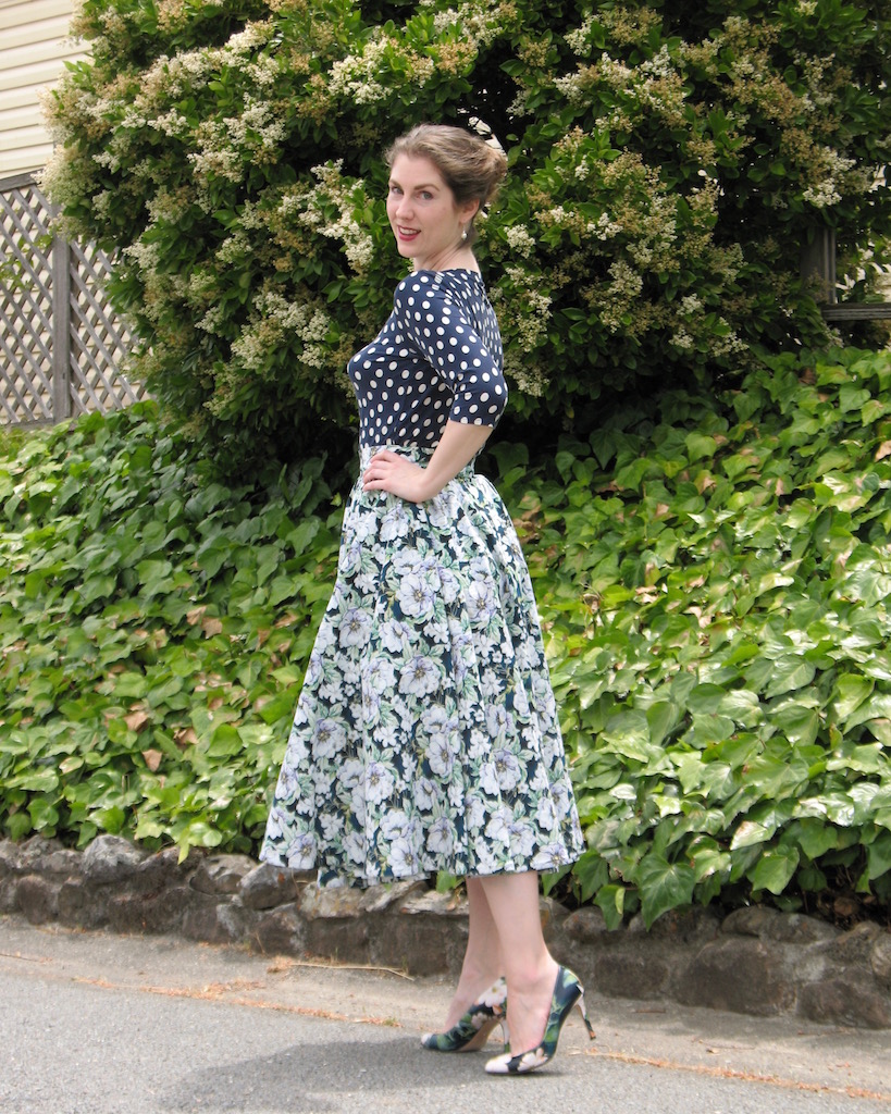
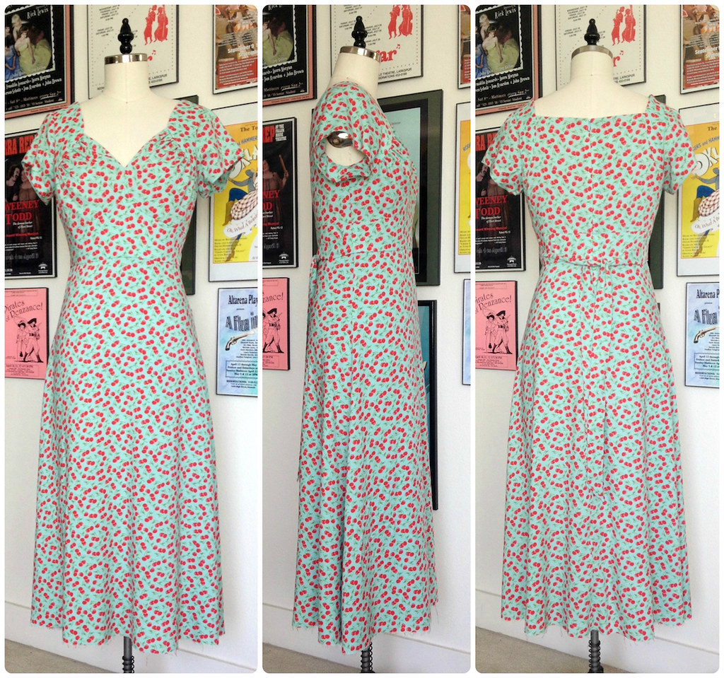
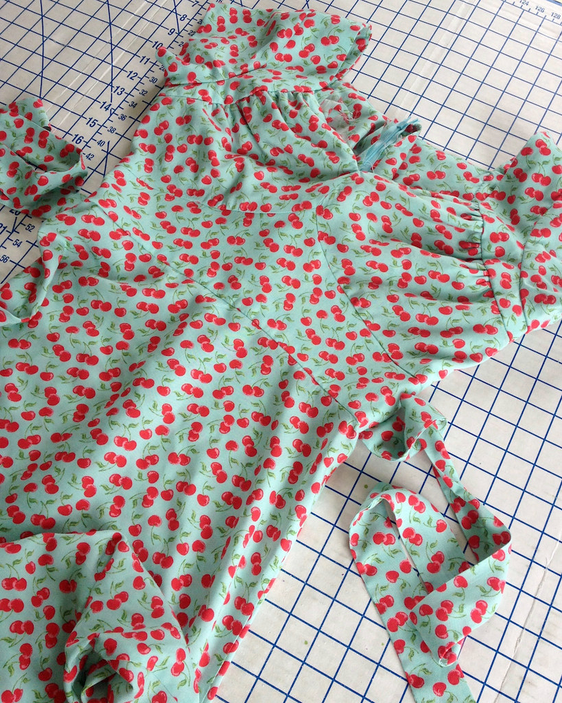
As far as the sewing goes . . . I have pulled Butterick 6320 out quite a few times, thinking I had found the perfect pattern for a bunch of different fabrics.  Well, this rayon challis from JoAnns (one of the Gertie prints from a couple of years ago, I think) was the ultimate winner.


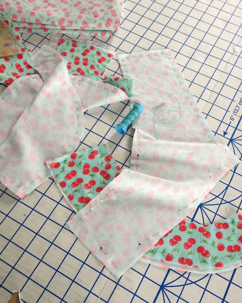
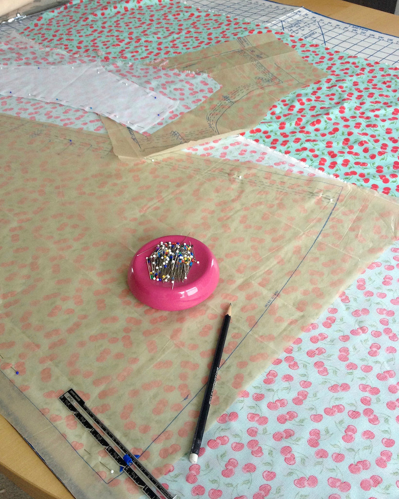
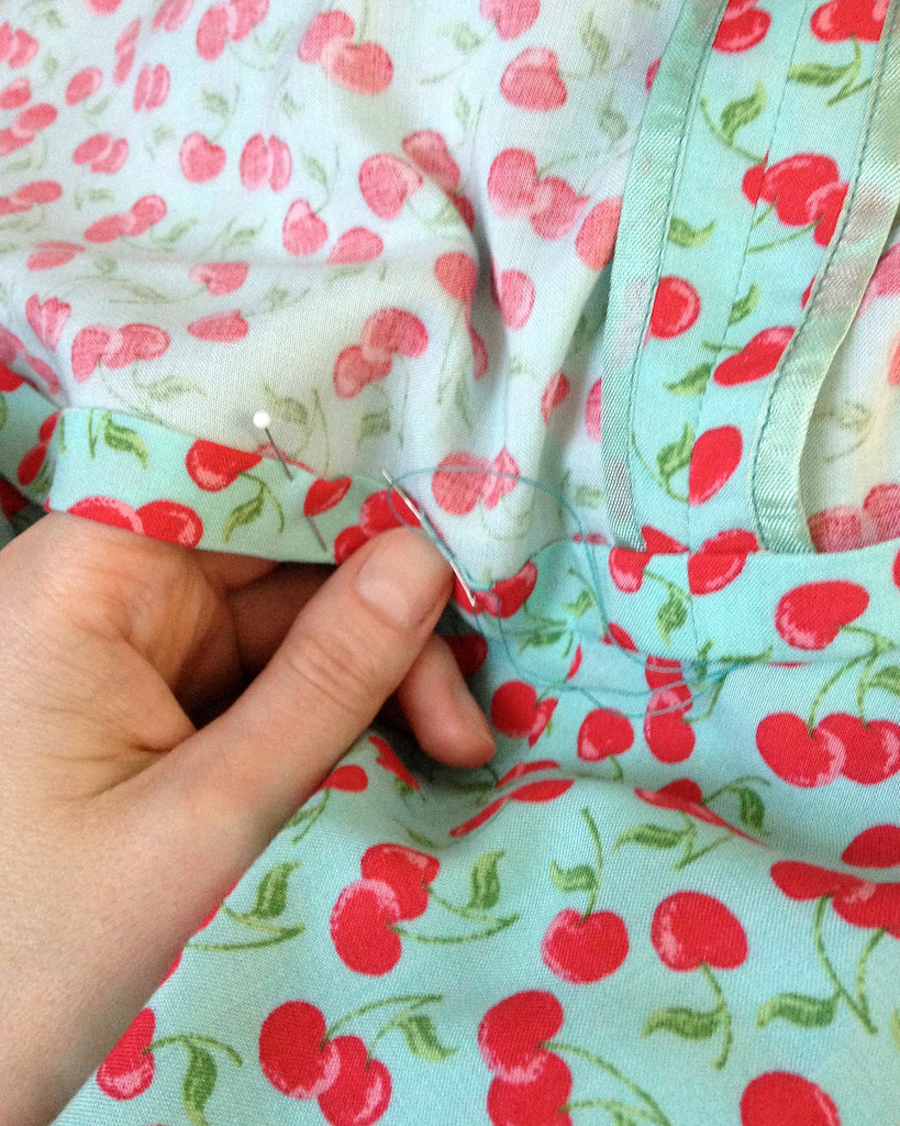
The rayon is quite lightweight, and with the light colored background, a bit sheer.  I decided to line the entire dress.  And instead of a fusible, I used cotton batiste scraps as a sew-in interfacing for the waist and shoulder yokes.


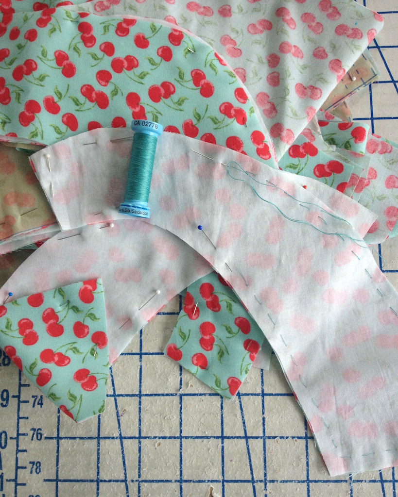
Since the cotton batiste is quite a bit more stable than the drapey rayon, I like to cut the cotton out first, and then pin those cotton pieces directly to the wrong side of the rayon to cut out that fabric.  Those two layers are then basted together.  When I first started sewing apparel, I used to cut one layer of fabric and one layer of interfacing.  Attempting to get a perfect match with the two was never quite possible, especially with a fabric that likes to move around!


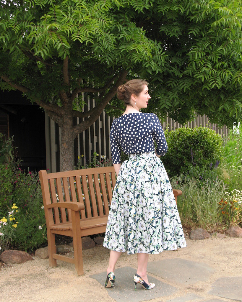
This dress went together quite easily.  I decided not to make any fit adjustments; the only change I made to the pattern pieces was to lengthen the sleeves.  I certainly could have lengthened the torso, but it sure is nice to work directly from a pattern every once in a while.  The fit turned out pretty great, even without that standard alteration, so I am quite pleased.


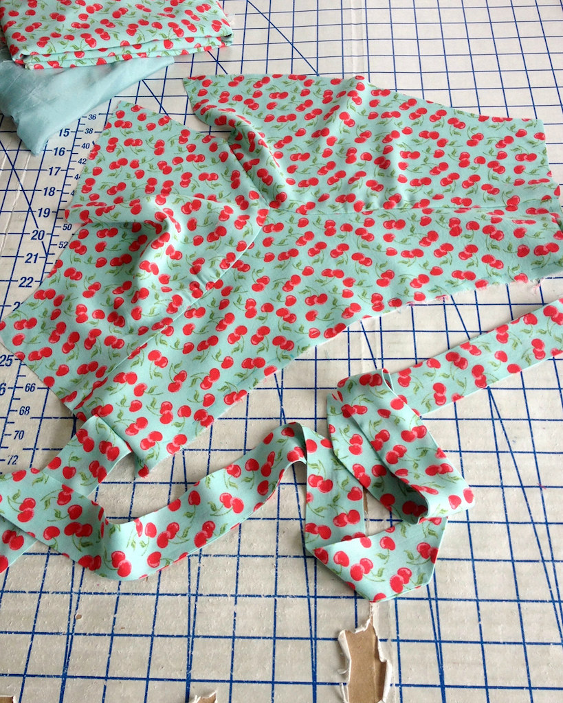
I went with an invisible zipper for this dress, stabilizing the center back opening edges with a narrow strip of fusible interfacing.


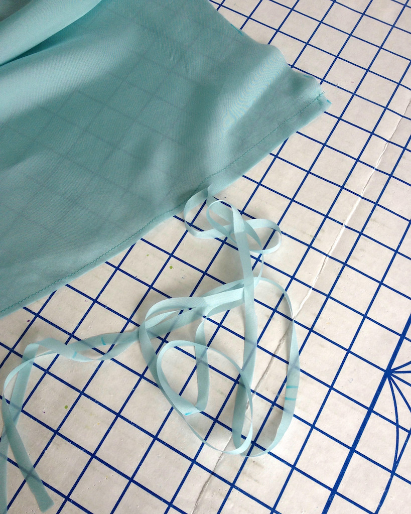
The skirt lining was french seamed.  The bemberg rayon and the printed rayon was very fray happy, and since bemberg is very lightweight, I thought it was the best choice.


The cherry print got my favorite seam binding treatment.


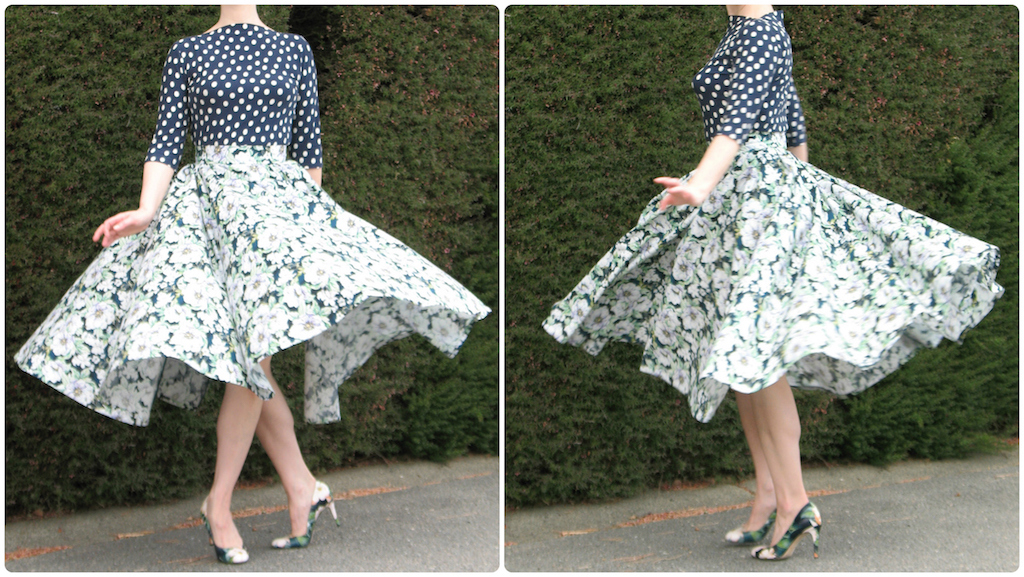
Rayon really is a fantastic textile.  It sometimes requires a bit more patience to work with than a lot of other fabrics, but the end result is so light and floaty.  I just love wearing it in hot weather (which we had quite a bit of this year)!  Farewell, my summer frock . . .


Sunday, September 24, 2017

Polka Dots and Floral Prints are Neutrals, Right?!


I am still playing catch up with a bunch of sewing projects that I would like to get posted on this blog!


In an effort to accomplish that as expeditiously as possible, I decided it would be a good idea to start combining multiple projects in one outfit.  This is one of those pairings.  Hey, at least my resolution to make more separates appears to be a success!


I suppose you could argue that the prints clash.  But really, I have so many different polka dot prints in my closet that I consider them a neutral!  


The top is the "Gable Top" from Jennifer Lauren Handmade.  Over a year ago, I tested this pattern.  Yikes!  This is what happens when you don't blog for months at a time.  

I would guess that most of the online sewing community is aware of this pattern.  It really is a fabulous design.  If/when I come across some great knit fabric, I am definitely going to be making myself more of these.  But for the moment, I am being pretty good about no new fabric purchases, so this pattern is going to be pushed to the back of the queue.  


I have actually made two of these so far.  The first "test" version was made using the pattern exactly as drafted with an inexpensive knit I had stashed away.  For this version, I ended up shortening the length of the bodice and sleeves because the polka dotted knit fabric was leftover from making this dress and there was very little to work with.  I actually prefer the shorter length.


It was necessary to cut the pieces on the cross grain to make everything fit with my small fabric pieces.  Since the knit has four way stretch, I figured that shouldn't be too much of a problem.


And it worked!


The top was originally made to match another Jennifer Lauren pattern, the Ivy Pinafore.


Then I found this floral cotton fabric on a trip to JoAnn Fabrics while looking for a non-directional print suitable to make myself another version of my favorite skirt (Butterick 4792).


The idea to match these two pieces came about because scraps of the polka dot knit were still on my cutting table at the time I started working on this skirt.  The blues matched perfectly, and the rest is history.  Now if only I could find some beautiful wool knit, I might be able to stomach making a solid colored version of the top.  But prints are just so much more interesting to play with!!


Blouse:  Made by me, Jennifer Lauren “Gable
Skirt:  Made by me, Butterick 4792
Shoes:  Corso Como “Webster”

Friday, September 22, 2017

The Emmy Awards Red Carpet 2017

I keep meaning to get back in the swing of things with this blog, but I continue to find other things to distract me.  But since the Emmys were this past weekend, and I haven't put my thoughts on a red carpet down on virtual paper in a while, I thought a critique would be a fun way to get back to it.

Once again, I continue to be surprised when my favorite look of the night is a pair of pants, or should I say, pantsuit.  What is happening here?!?  But I think we can all agree that Claire Foy looks radiant in Oscar de la Renta.  Love the understated jewelry paired with that embellished neckline, love the dramatic drape, the shoes are perfect (and the fact that I can see them is very much appreciated).  The hair and the makeup is pretty perfect, too.  It's definitely the best ensemble of the evening, in my opinion!


Multiple hemline lengths continues as a red carpet theme, and I really like the variety.  I would say Michelle Pfeiffer's dress (another Oscar de la Renta) is a bit informal, but then again, this is the Emmys, not the Oscars.  I don't really like the way the diaphanous material becomes almost opaque in the skirt, and the embroidery is a little clunky looking, but I do like the overall idea of the dress.  Not thrilled with the hair, but it would be rather challenging to make Ms. Pfeiffer look bad.  And there it is . . . on almost anyone else, I think I would have passed this dress right by.


I would really like to see the texture of this Zac Posen gown up close and personal.  His designs have been rather hit and miss for me lately, and while this silhouette is nothing spectacular, I do like the pleating on the skirt, and from what I can see, the textile looks gorgeous.  I love the emerald accessories, and I actually like the nude lip here.  And the hair is actually styled, imagine that!


I do love a caplet as an unexpected accessory on the red carpet.  I think that the low ponytail does not work with the volume that the caplet adds to the silhouette, especially since the color of the hair matches the dress.  Zuhair Murad does this bead encrusted gown on a sheer fabric look over and over, and while it can get boring, this particular one works for me.  The necklace also looks off, but I think if the hair was piled on top of her head, I might like the diamonds as a collar.  Or perhaps she could wear the diamonds in her coiffure, à la Ginger Rogers or another 1930s movie siren.


A print on the red carpet is always fun, but very challenging to get just right.  I think this silhouette works really well with the bold print design.  But we do have a case of the old horsehair hemline rearing its ugly head.  Why on earth is there horsehair added to a train?!  I am not sure who Alex Hudgens is, and I think I would have chosen a lavalier on a long delicate chain in place of the stiletto earrings for this gown, but overall, I really like her look.


Speaking of prints, I can't find any information online about Catherine Dyer's gown, but I am guessing that it is vintage.  The clunky bag is a horrible addition, and I am not sure I like what is going on in the shoe department, but I am definitely intrigued by this dress.  The floral print is not my favorite, but at least this has some personality.  I think this dress choice belongs on a cabaret stage, with a oversized flower tucked behind the singer's ear, and not in a daylight shot on a red carpet, but I do appreciate the far from standard choice.  Unfortunately, the styling just went wrong, from the sloppy hair right down to her bracelet and earrings.


Here is another different approach to the standard red carpet look.  I love the print, and this may be heading into Morticia Addams territory, but I think the golden bronzy print does wonderful things for Jamie Alexander's complexion, as does that makeup.  It's a glamorous Halloween look.  And do I spy some little birdies in that print?  I would also like to thank Ms. Alexander for not succumbing to the highly contagious "thrusting her thigh out of the slit in her dress" sickness that affects so many actresses on the red carpet these days.  


Now, I do love a good velvet . . . and the color of this is yummy.  The Ralph Lauren design is rather boring, but can we talk about the scraggly hair for a moment.  This may be the worst yet.  Who looks in the mirror and thinks this is "done."  This honestly looks like she just rolled out of bed with last night's makeup smeared on her eyes and did nothing to her hair.  The silk velvet deserved so much better . . .


Speaking of gorgeous green colors, this is an amazing color choice for Shannon Purser.  Don't have any idea who she is, but her stylist is right on the money with this fabric and color for her pale skin.  I do wish the non draped side of the bodice sat slightly off her shoulder - I think it would be much more flattering to her silhouette.  The clutch doesn't really work for me, and the embroidered additions of the butterflies is slightly arbitrary, but I think that could easily be fixed by re-spacing them or grouping them a bit differently.  Overall, this is a beautiful and dramatic look.


Reese Witherspoon is adorable, and if anyone can get away with wearing a slightly lengthened suit jacket as a dress, it's her.  I wish the the fabric was a little less shiny for this look, but the shoe choice is perfect for this.  Her legs look amazing in the Stella McCartney design, so all is not lost.  But next time, save this one for the People's Choice Awards, or something a little bit less formal.


Okay, I HATE this color, and I think it makes Angela Sarafyan look green in the gills, but the design lines and the smocked sleeve are gorgeous.  The slit is probably overkill; I can't imagine she would have trouble walking with all that fabric in the hemline, and I think it ruins the line of the skirt.  If this was on someone with coco colored skin, I think it would be stunning, but this particular lady needs to stay away from this hue.  Her makeup is also not helping her look any less flu symptomatic.  Now if there is a merlot colored version, or perhaps sapphire or emerald green, I would love to add this one to my closet.


Now Viola Davis could get away with wearing chartreuse, and come to think of it, the silhouette of that last gown would also look amazing on her.  But she picked another amazing color for her Zac Posen dress.  This is gorgeous on her.  Hate the clutch with that bracelet, and I am a little confused if the hairstyle is supposed to be asymmetrical or centered, but I am going to ignore that and hope that it is just a strange angle for the camera.  Another wonderful red carpet choice for Ms. Davis - now if she would just learn how to walk in heels.


Oh my god, what did Jane Fonda do to her face?!?  I cannot even look at the dress because I am horrified by the disfigured face.  I guess we just have to title this "when bad plastic surgery happens to beautiful women, Part 42,329."  Okay, now I am going to take another look at the actual dress.  The shoes are atrocious, the hair is really bad, and with the pink color it looks like she is attempting to channel Malibu Barbie, the necklace does not work with the neckline of the gown . . . it just keeps getting worse.  Actually, I think the Brandon Maxwell dress had some promise, just not with all the distractions.  And why did she do that to her lovely face?!?


Nicole, Nicole, Nicole . . . finally you choose to wear some color!  And guess what, you look wonderful.  This is probably my second favorite look of the night.  And here is another bejeweled neckline; I usually hate those because they remind me of bad Macy's prom gowns, but this looks rich.  Love the length, and I even like her hair color - hooray for no more platinum blonde on pale skin!  Okay, I think the mis-matched shoes are a little much for this dress, and the hair is a little messy for my taste, but this is a really lovely look on her.  If I am being really nit-picky, Calvin Klein needs to be a little more careful with the hemline, but other than that, this is stunning.


Unfortunately, we couldn't escape without some actress wearing a gown that matches her skin color.  At least Shannon Woodward has dark hair, but this dress would look so much better on her in a tone that does not blend right in with her complexion.  I do love the silhouette, though - the bodice and the sleeves are beautiful.  I would love to see the back of this; do I spy another caplet?


Ahhhh - what is this hair?!?  Make it go away, please.  I almost missed the amazing fabric because I was distracted by the brassy and incredibly ratty and lank hair.  The asymmetrical ruffles need a little work (maybe they should overlap slightly, or stop slightly lower on the hip?), but there is the possibility of something really lovely here.  Gosh, I love sleeved evening wear!


More bad hair, but I am going to give William H. Macy a pass.  Felicity Huffman, on the other hand, looks fabulous from head to toe in Tony Ward.  The color is amazing on her, and I love the textile.  Is it embroidered, or a burn out, do you think?  This is another one that I would love to see up close.


Show business kids usually irritate me, but this mini tux is just too cute.  Why is everything so adorable when it's tiny?!  Not entirely sure that I love the lack of socks, but if a cropped pant is going to work for anyone, it's Miles Brown.  Not sure what show he is in, but the kid has attitude, that much is clear.  And why don't men wear white dinner jackets on the red carpet more often?


And for the grown-up, female version, here we have Evan Rachel Wood in Moschino.  I love that she keeps wearing these feminine versions of tuxedos every award season.  I hate that it so often appears that she has no feet.  Where is my hint of gorgeous footwear?  Oh well, I guess no one can be perfect.


[Click on image for source]

Wednesday, September 13, 2017

More Butterick and McCall Vintage Reproductions Released into the Wild

Vintage reproductions come and go in the McCall, Butterick, and Vogue catalogs, and for the most part I like them and I stitch them up all the time, but very few actually thrill me these days.
So I was very pleased to see this 1944 design released in the latest Butterick catalog.  Classic style lines, more than a few interesting shapes to contend with, and an overall gorgeous look.  It almost makes up for the Vogue catalogs that do not include any new Vintage Vogues!  I am definitely going to have to rummage through my stashed fabric to find something suitable.


There are two new Gertie designs as well.  The first has a dropped waist and raglan sleeves.  It's not the most complex thing in the world, but the lines are really lovely.  I believe the three-quarter sleeved version will be added to my to-make list (which is getting really, really long).

Simplicity recently released a vintage reproduction in the classic cheongsam style, but I have never seen a full skirted version (probably because most are princess seamed and do not have a waist seam that lends itself to multiple skirt options).  I am not sure I love the full skirted silhouette with this bodice treatment, but it may grow on me.  I think I am going to see what other people do with this before I start cutting into fabric.  
And then McCalls went and released 7625.  It's another dropped waist design, this time with side hip gathers and a button front.  Love it!  I was initially surprised that this is a 1955 silhouette; the styling with that 40s hat threw me off, but the technical drawing is very mid 50s, and I adore the short sleeved version.  Will I make this before the weather gets chilly?  Probably not, but this one will definitely be getting my attention in the future.
And there is even a modern design that I may have to add to my collection.  I am always interested to see how these off the shoulder sleeves are drafted.  Some work better than others, and I may have to test 7654 out for myself.  And can we talk about how fantastic that black floral fabric is?  Don't break my heart and tell me it's polyester.