
Simplicity has released their latest collection, making me question my choice to squeeze in one more wool project before the weather really turns - is it summer already?
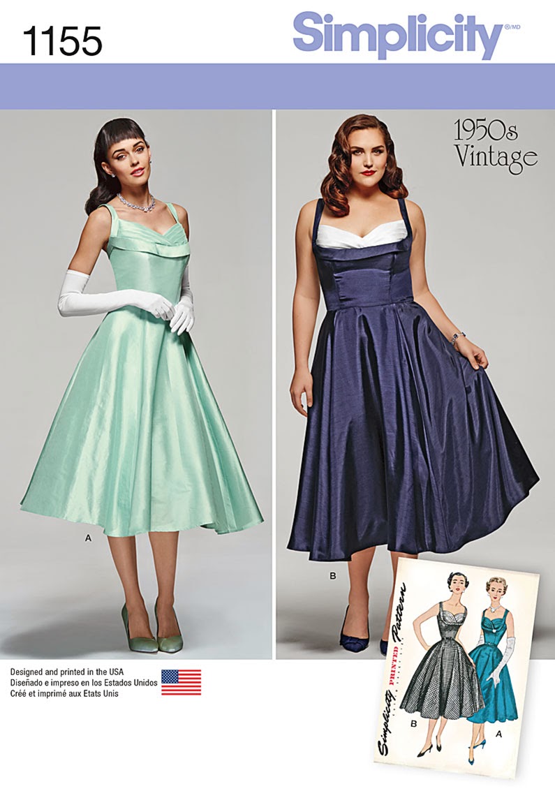
And it would seem that the shelf bust is incredibly popular this year (Butterick has two “modern” versions produced for their Patterns by Gertie line if this one does not thrill you). I went looking for the original, and this is what I found:

Interestingly enough, the original design includes sleeves. I cannot understand why they would not have reproduced that detail.

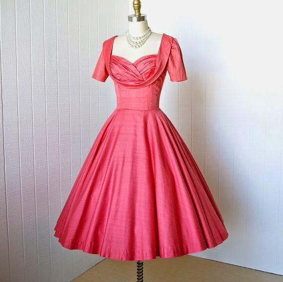
Well, the back treatment is my answer. The straps are the problem. The original Simplicity 4704 is full coverage through the armholes and back. And wait a minute . . . the strap treatment on the front of the bodice is different, too.

Perhaps Simplicity has morphed two different
patterns? But the original 4704 artwork is included on the new reproduction, right down to the checkered print (it looks like they just
photo-shopped the sleeves out).
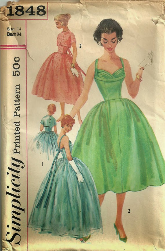
But wait . . . the original design looks a whole lot more like Simplicity
1848. So why is Simplicity 4704 included on the new cover art? What is going on here . . .
and where has my cute bolero pattern disappeared to? Also, they have changed the skirt. Why? Perhaps the full length version used too much pattern tissue for one design, but why add gores to the short version when neither of the vintage versions do? What exactly were they trying to reproduce?

So it would seem the answer to the age old vintage
reproduction question, “do they alter the design?” is a resounding "YES." I am not sure I like this answer.
There has also been some controversy about the seam
placement falling above or below the actual bustline on this style. The
contention is that if that seam does not sit below the bust it looks like a fitting mistake. Well, I think the answer is less clear than that, and has to do more with the proportions of the actual person wearing the dress, and, of course, the dress itself.

If you look at
vintage versions of the shelf bust style, the bust area starts to
look very large and matronly if the lady wearing it has significant assets, especially when
the pleated/ruffled area is full coverage. If you wish to minimize the bust, drawing a design line right through the bust and using a contrasting color can really help to accomplish this.

I think the more successful of these designs incorporate some kind of draping or folds to disguise that bisected line that cuts across the bust. This is missing from all of these reproduction designs (both by Simplicity and Butterick) and is, perhaps, what does not quite work on the larger model in Simplicity 1155, whose under bust measurement is significantly smaller than her full bust.
If, on the other hand, you often use a small bust adjustment, exaggerating this area might be something you want to do. Wrapping that portion of you figure with a bias band of fabric will certainly accomplish this. In this case, the seamline is placed right at the underbust, making a smooth lower bodice panel easy to fit without smooshing anything.
The danger, I believe, lies in either extreme. Personally, I do not want to look flat chested in a 1950s design (a dress from the 20s is a whole other story), but I also do not want to look the prow of a ship with a bust that enters a room two minutes before the rest of me.
What do you think of these designs? Where should that seamline sit? Thoughts? Comments? Would you make any alterations if you were drafting the pattern style lines for yourself?

But enough of the self busts! What I would really like to see is a petal bust design, please!

And by the way, there is a second vintage reproduction. This playsuit set is adorable - very Roman Holiday. The bra top design is somewhat similar to Simplicity 1426, but the whole look is wonderful. Some may be disappointed that a pair of shorts is not
included, but I really, really like this.
It is not groundbreaking, and not terribly complex, but the armhole cut on
that shirt, the wide shaped waistband, and the pleats on the skirt just makes me happy.

There is even a jumpsuit design that I am strangely drawn to
. . . if only my legs were six inches longer, I think I could pull that off .
. .
But for now, I think it is time to spend some time with one of my unfinished knitting projects and a cup of tea. Here is to a
productive weekend!
[Click on image for source]
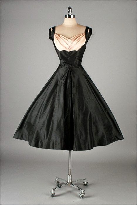
I love the shelf-bust look, but for me the shelf either needs to extend down over the whole bust, or have a lot of draping to disguise the lines of the area underneath. Otherwise it just looks like the dress is really badly fitted! I was excited when Gertie brought out her first of these designs, til I realised it'd just look like I had no idea where my own bust was, without significant alteration.... I mean, you have to feel for the model in the blue on this Simplicity repro, don't you? Whereas that black wiggle dress with the gold leafy bits? How lovely is that?
ReplyDeleteThe playsuit set is really cute though! Just need a Riviera holiday to wear it on...
X
The black wiggle dress is pretty excellent, isn't it! I want one of my own!!
DeleteBut I do agree that there is a fine line between looking like a mistake and looking like a style choice. It's an interesting fitting challenge . . . throw in some contrasting color or print choices, and it becomes even more complicated!
I love the jumpsuit, and it took everything in me not to buy these patterns. I said I will wait for a sale. My husband didnt understand.
ReplyDeleteI hear you! I have cabinets filled with patterns, a bunch more spilling out all over my apartment, and I am still lured in with each new catalog release. Why?!?
DeleteI'm not into reproduction patterns for this reason, they don't match their inspiration enough. Even some of Gertie's stuff fails to look vintage to me... I'm not sure why that is exactly. I mean, the designers likely aren't trying to make things more modern. Perhaps in an attempt to make patterns easier/more accessible, they've changed the design elements that make these garments look authentically vintage in construction. I've also wondered if these design elements get changed in the pattern grading process, maybe in order to fit more sizes easily. Either way, I'm going to stick to buying the originals.
ReplyDeleteOh, and it doesn't surprise me that they'd Photoshop the art to look a certain way, I recently found McCall's does this to manipulate the look of their final garments.
But what does it have to be easier? I feel like the more techniques I come across in pattern instructions, the better. That is how I learned to sew garments. The vintage techniques are not more difficult, they just can take a bit more time.
DeleteLike you, I love the originals . . . but it is really nice to have a cheaper and readily available option that I know has all the pieces included! I just wish they would stick with the vintage techniques right through to the instructions.
Yes those shelf busts... I've never liked any of the reproduction or Gertie ones but I love the real deal from the 1950's. You are probably right about the need to adjust the seam placement to one's figure but I don't even think that's all (after all, pattern companies can't really do that because they draft for one 'standard size'). Most of these modern shelf bust dresses looks like they haven't bothered to shape the bodice as much and their version of a shelf bust is usually just something like a strap under the bust (or rather over the lower part of the bust). In vintage dresses, there is usually a lot of interesting shaping and/or draping for the shelf. I tried my hand at drafting a design like that a couple of years ago and although it's definitely not perfect I still like it better than what the pattern companies are offering: http://petitmainsauvage.blogspot.nl/2010/07/new-dress.html
ReplyDeleteOh, and I think I know why they changed the design of the shoulders and back: This is much easier to fit.
Your dress is gorgeous! And I agree with you on the strap placement . . . it's all about proportion!
DeletePerhaps one day the Big 4 will realize that dumbing down vintage designs is not necessary . . . ditto with the instructions.
[Audible exhale] I'd like to say, "I have nothing to add to this conversation.", but we both know better than that, plus you asked.
ReplyDeleteStarting with the jumpsuit; in your 30s dress of yore, you appeared quite leggy. It's all about a high waistline and heels, and you have both. With slightly pegged legs, and a Shelley Hack "Charlie!" 'doo, you could push your decade hopping boundaries northward to the mid-70s (not that I'm nefariously drawing you toward all things 80s...I would never do a thing like THAT!). wear a cropped jacket with it, and you'll further accentuate the height of your waistline.
Bust shelfs should be like underwire, as in this photo of Elizabeth Taylor ( http://www.theguardian.com/film/gallery/2011/mar/23/elizabeth-taylor-gallery-queen-of-style ), every other placement reads wrong. Wrong, I tell you.
My only beef with that first pattern is that the live models have waistlines which appear in print to be twice the width of their faces, where as the illustrated models have waistlines roughly equal to one face width. Unless one was some utter freak of nature who had every measurement increase with age, save for one's shrinking waistline (not that I harbor even a single jealous bone in my body against such a creature), comparing the live with the illustrated is patently unfair.
Even with the less artful skirts being shown, it is obvious that the pattern companies haven't utilized your tutorial on crinolines.
In short, do what you will Laura Mae, as you have ardent fans who who support and marvel at your every decision.
Oh I wish they had exactly copied the original design with the sleeves! I would have loved that! Oh well. But that playsuit certainly looks fun!
ReplyDeleteBrigid
the Middle Sister and Singer
boyerfamilysingersblog.com
How weird that they would morph two designs together, but only admit to the one! It looks like they took the flared skirt from the one pattern and the bodice design from the other... I like the flared skirt, but a full-back option would've been nice, since there are already a couple of strappy shelf-bust dress patterns on the market.
ReplyDeleteI personally like the way the shelf-bust designs look when the shelf seam is just below halfway down the bust, and I really like my version of Gertie's first shelf-bust dress (but I did go completely rogue on how I fit the seam and the cups and just did what worked for my figure, which may be the key. ;) The seam is definitely above the bottom of my bust, for sure, which is intentional (and I'm not busty, certainly not by 50s-ideal-standards.)
/sigh. It does make me sad that Simplicity patterns are so hard for me to get now...
I think you are right . . . I completely missed the gore lines on the checkered version. But they don't appear on the teal. I was thinking it was a basic circle skirt. And I totally agree that a bit more coverage would have been a nice change from the other currently available options. Although, to be fair, Simplicity would only have known about the one version when they were deciding on this catalog.
DeleteI, too, made that Gertie pattern and love it. They design does not sit under my bust and I think it look just fine . . . but maybe I am one of very few who would agree!
Lovely interesting post - thank you! I was also wondering about the placement of the shelf bust designs as I do sometimes think they look very weird and like they should be under the bust instead of straight across. However your examples show it working beautifully.
ReplyDeleteHope you had a productive weekend!
Anna K
I remember seeing Liz in her shelf bust dress, stunning! And this was no flat chested female so I say that to think it is not a good idea to have the seam below the bust for the more heavily endowed is wrong. Marylyn Monroe also wore similar designs.
ReplyDeleteThe Gertie design and these two from Simplicity just look like a fitting mistake to me. The more amply endowed can easily compensate with smaller, flatter pleating and embellishment. There are ways to make this look wonderful in that situation and to just write it off for anyone over a C cup means a study of these two women and their style is in order. Marylyn and Liz both made this style look utterly fabulous and feminine with their properly placed seams. The patterns, not so much.
I take your point, although both Liz and Marilyn were not afraid of showing cleavage. The famous Liz Taylor picture show a neckline that is a good two inches lower than Simplicity’s latest release. Raise the neckline on that photo and the design would look very top-heavy to me; that is nothing against Liz Taylor’s figure . . . I think she was gorgeous. But I think a change in the dress proportions would make her look less stunning.
DeleteI just think the proportions become odd when the bust pieces have too much coverage. The wider those pieces become (as they would with a larger bust), the more potential there is for an awkward proportion. This issue is less pronounced if the wearer has a smaller bust measurement. There is a reason runway models often have very small busts . . . more curves to get in the way of the design and emphasize any faults in the design. Is that the case here? I am not sure.
Since we make our own clothes, we can make that choice. Do I want to maximize my assets or minimize them? Style lines and color choice does that for us. And both versions of the under the bust and also the bisected seamline exist in the vintage silhouette as we see from different pattern designs and actual vintage garments. I actually think the stylized drawings of 4704 are bordering on too much coverage, and those are with completely idealized proportions.
The larger model in the pictures has a neckline that is almost level with her armpit. The smaller model is wearing a dress that has a significantly higher neckline that starts almost at the shoulder line. I don’t imagine these were made to order for each specific woman, so there may just be fitting issues . . . who knows?! And let’s be honest, the construction of those dresses is not great. The uneven hemlines, and the puckered seams make that clear. But I do wonder what the design would look like it the larger model’s dress had that bust seam at the underbust? With the white contrast, I think it might be a little much (in my opinion).
Simplicity 1848 is clearly cutting across the bust and is an original vintage design . . . both options were available, so I am not sure why there is so much debate about that option being “wrong.”
Then again, it’s always great to hear differing opinions. In the end, it’s all a matter of personal taste. We should all wear what we love, whatever that may be. And was certainly not trying to exclude anyone from either option.
But I do love a good discussion!
Damn, those missing sleeves are disappointing. They would have set this pattern apart from Gertie's. So far I haven't seen anything to make me go out and buy another bust shelf pattern. A PETAL BUST though, would be an instant smash.
ReplyDeleteLaura Mae, when I saw Simplicity 1155 the other day, I thought of you. I think I prefer the original design with sleeves though.
ReplyDeleteI would be very interested to know how Simplicity source the inspiration for their patterns, considering what you have posted and what I know of Butterick and Vogue.
ReplyDeleteEvery Vintage Vogue pattern I have checked has matched the original pattern and this corresponds with what other people have shown. There are minor discrepencies like changes in waist size (modern vogue users a narrow waist then 40s vogue) and slight length differences.
Butterick on the other hand if you compare the reissue with the original there are significant changes. I counted 15 (iirc) for one dress alone. Things like closures moved, gathers changed to darts, armscye changed to the point the modesty panels inserted into the base of the short sleeve to cover your bra no longer needed and the reissue does not have them, three gore skirt back changed to two gore, jewellery interpreted as buttons, the asymetric drape greatly reduced in the original and so on.
The thing is Vogue uses original patterns and iirc you posted that Butterick uses drawing as their basis. So I wonder which method Simplicity is using. The differences you highlight would suggest that Simplicity is following Butterick route.
-aisling
I'm not sure what's up with the shelf-bust trend right now. It doesn't seem to be flattering to anyone, chesty or not. The second pattern, however, is absolutely gorgeous! I love that blouse. I can't wait to order it and start sewing!
ReplyDeleteNaomi
teenyboppinalong.blogspot.com
How would we make the pink or red checked dresses? Are they made using the old pattern or adjusting the new one. They are exactly what I want to make!
ReplyDeleteBoth the pink and red vintage dresses have the seamline sitting below the bust - that is not how the reproduction pattern and vintage pattern posted here are drafted, so it would require some alteration. There are vintage patterns with the seamline sitting below the bust, so you may want to keep looking for one of those, depending on how comfortable you are with altering patterns.
Delete